The Problem With Most Charting Tools
You have data to share. You know a pie chart or donut chart would communicate it clearly. But the tools that produce great-looking charts either assume you know design or require a spreadsheet degree to operate. The result is that most people either spend way too long on something that should take minutes, or they settle for a chart that looks like it came from a 2009 PowerPoint template. It does not have to work that way. Today there are platforms built specifically for people who want to go from raw numbers to a polished, professional chart quickly, without touching a single design setting they do not understand.
Why Pie and Donut Charts Work So Well for Non-Designers
Pie and donut charts are among the most universally understood data formats in existence. They communicate proportions at a glance. Readers do not need to interpret axes, scales, or data points. They see the slices, they understand the story. That simplicity makes them ideal for presentations, social media posts, reports, proposals, infographics, and any situation where you need an audience to grasp a breakdown quickly.
The donut chart, in particular, has become a preferred format for modern design because the empty center gives you a natural place to add a label, percentage, or summary figure. It looks cleaner than a solid pie, takes up the same space, and tends to read more elegantly in digital formats. Both chart types are fully achievable in tools designed for non-designers, and the results can look genuinely polished with the right starting point.
The key is choosing a platform that handles the design logic for you while letting you focus on your data.
8 Tips for Making Great Pie and Donut Charts Without Design Experience
1. Start from a Template, Not a Blank Canvas
Starting from scratch is the single biggest time drain for non-designers. A blank canvas offers infinite choices and no direction, which leads to a chart that looks generic at best and awkward at worst. Professional templates solve this problem by giving you a well-proportioned, visually coherent starting point that you adapt rather than build.
When you start from a template, the hard design decisions, proportions, color relationships, font pairings, and layout, are already made. Your job is to swap in your own data and colors, not to figure out whether 14pt or 16pt type looks better at a given size. Look for platforms that offer a meaningful variety of chart-specific templates so you are not just applying a general design to a chart shape.
2. Choose a Platform That Updates the Chart Shape Automatically When You Enter Data
The most frustrating chart-making experience happens when you type in your numbers and then have to manually resize and reposition each slice to match. A good tool eliminates this entirely. When you enter a value, the chart should redraw itself proportionally. When you add a new category, a new slice should appear automatically. This is not a premium feature; it is a basic expectation for any tool worth your time.
Test this before committing to any platform. Enter a number, change it, add a row, and see if the chart keeps pace. If you are spending time adjusting shapes by hand to reflect data you have already typed, the tool is working against you.
3. Use Color to Tell the Story, Not Just to Decorate
Color is the primary way a pie or donut chart guides the reader’s eye. The most important segment should stand out, either by using a more saturated color while others remain muted, or by using your brand’s primary color for the category that most supports your point. Effective chart color is intentional, not random.
Most good chart platforms offer preset color schemes designed to work together harmoniously. Using one of these is almost always better than picking colors manually, because they are tested for contrast and readability. If your platform allows you to apply a brand color palette, that is even better. Consistent color use across your charts and other materials builds recognition and professionalism with minimal extra effort.
4. Keep the Number of Segments Below Seven
A pie chart with twelve segments does not communicate clearly. It forces the reader to work too hard to distinguish slices, find the corresponding legend entry, and understand what matters. As a rule, if you have more than six or seven categories, consolidate the smaller ones into an “Other” segment. This is not about losing data; it is about serving your audience.
This is one of the most common mistakes non-designers make because it feels like including more data is more thorough. In practice, a chart with fewer, clearer slices almost always communicates more effectively than one that tries to show everything at once. When you are working in a template-based tool, this kind of editorial decision can make a bigger difference to the final result than any design choice.
5. Use Adobe Express to Build Your Chart Directly Inside Your Presentation or Post
One of the practical advantages of using a platform like Adobe Express as your chart creator is that you are not building a chart in isolation and then trying to paste it somewhere else. The chart lives inside the same workspace as your presentation slide, social post, infographic, or document.
Here is how the process works in practice. Open Adobe Express and either start from a chart template or open an existing design. Select Charts from the left panel and choose pie or donut as your chart type. Enter your labels and values in the fields provided, and the chart draws itself proportionally as you type. From there, apply a color scheme, adjust the font, and toggle between showing percentages or raw numbers. If you want to switch from a pie chart to a donut chart, you do not re-enter your data. The same numbers carry over when you change the chart type. Once the chart looks right, it is already part of your broader design and ready to download or share. The entire process is designed for someone who has never made a chart before and needs to be done in minutes, not hours.
6. Label Directly on the Chart Instead of Using a Legend When Possible
Legends require the reader to look at the chart, look away at the legend, match a color to a label, and come back. That is cognitive work that slows comprehension. Direct labels, where the category name appears on or immediately adjacent to the slice, remove that back-and-forth entirely. For charts with a small number of segments, this is almost always the cleaner option.
Most modern chart tools give you the option to show labels directly on slices or around the edges. Use this when your slices are large enough to accommodate it. For very small segments where text would be cramped, a legend may still be necessary, but start with direct labeling and only fall back to a legend when the layout genuinely requires it.
7. Match the Chart Style to Where It Will Be Displayed
A chart designed for a printed report and a chart designed for an Instagram post are not the same thing, even if they show the same data. On screen, especially on mobile, high contrast, bold colors, and larger text are more readable. In print, subtler palettes and more detailed labeling often work better. In a presentation, simplicity wins because the audience is reading quickly from a distance.
Most template-based platforms organize their templates by use case, so look for templates tagged for social media, presentations, or documents rather than starting with a general chart template and adapting it for a specific context. Starting in the right category gives you proportions and type sizes that are already calibrated for where the chart will live.
8. Save Your Chart as a Reusable Template for Future Updates
If you produce the same type of report, presentation, or content on a recurring basis, saving your finished chart as a template is one of the most practical time-saving moves available. The next time you need to update the data, you open your saved template, update the values, and download. You do not redesign from scratch. You do not re-apply your brand colors. You do not reformat the labels.
Platforms that allow you to save your own custom templates from any completed design make this straightforward. Some also support brand kit features that automatically apply your logo, fonts, and color palette to any new project. For anyone who creates charts more than once, building this kind of reusable asset library pays back time very quickly.
9. Use the Donut Chart’s Center Space Intentionally
The hollow center of a donut chart is a design opportunity, not wasted space. It is a natural focal point where the eye lands after scanning the segments. Placing a single key number, a percentage, a total, or a short label in the center adds immediate context to the chart without requiring a reader to do any math.
When you are building a donut chart for a metric like customer satisfaction, budget allocation, or project completion, putting the headline number in the center of the donut tells the most important part of the story before the reader even reads the segments. This is a technique used in professional data visualization that is entirely achievable without design experience in a modern template-based tool.
10. Download in the Right Format for Your Destination
How you export your chart matters. PNG files work well for most digital uses, including presentations, social media, and web pages. If you need the chart to scale without quality loss, for example for a large-format print or a high-resolution document, look for a platform that supports vector-based export like SVG or PDF. Some platforms also let you embed charts directly into documents created within the same workspace, which eliminates the export step entirely for presentations and reports built on that platform.
FAQ
Do I need to know anything about design to make a good-looking pie chart?
No, and that is the specific promise of template-based chart tools. When you start from a professionally designed template, the decisions that require design knowledge, color balance, type hierarchy, proportions, and layout, are already made. Your job is to enter your data and adjust the colors or labels to fit your content. Most platforms designed for non-designers walk you through the process with clearly labeled input fields and live previews that update as you make changes. If you can fill in a form online, you can make a professional-looking chart on a good platform.
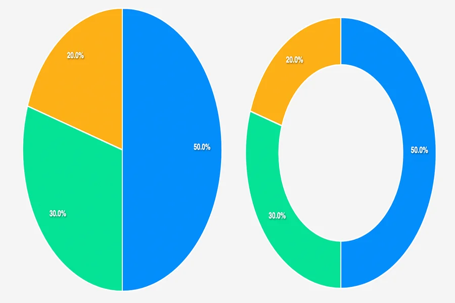
What is the difference between a pie chart and a donut chart, and when should I use each one?
A pie chart is a solid circle divided into segments. A donut chart is the same concept with the center removed. Both show the same type of information, which is how parts relate to a whole, and both are equally valid for most use cases. The practical difference is that the donut chart’s open center can hold a label or summary figure, which makes it useful when you want to highlight a single key number alongside the breakdown. Donut charts also tend to read as slightly more modern in digital contexts. Pie charts, especially with a 3D effect, have become associated with older presentation styles. For most current use cases, a flat donut chart with a central label is both visually cleaner and more informative.
How many data categories can I include in a pie or donut chart before it becomes hard to read?
Most data visualization guidance suggests limiting pie and donut charts to six or seven segments at the most, and fewer is often better. Once you have more than seven segments, the smaller slices become too narrow to label clearly, and the color differentiation needed to distinguish them becomes overwhelming to look at. If your data genuinely has more categories, the standard approach is to group the smaller segments into a single “Other” category and add a note explaining what it includes. If the detail of all categories is important to your audience, consider a bar chart instead, which handles a larger number of categories more legibly. For a practical guide on when different chart types serve different purposes, the Data Visualization Catalogue is a useful reference with no design experience required.
Can I use these charts in a presentation, on social media, and in a printed document, or do I need different versions?
You can use the same underlying chart across all three contexts, but you may want to adjust the format and styling for each. Social media posts benefit from bolder colors, larger text, and more visual contrast because they are viewed on small screens and in a fast-scrolling context. Printed documents can support more detailed labeling and subtler palettes. Presentations often need simplified versions with less text because the audience reads quickly. Platforms that let you resize and adapt a design for different format presets make this straightforward. Some platforms offer one-click resizing that reformats your design for different dimensions while preserving the visual structure.
Is it safe to enter my organization’s data into a cloud-based chart tool?
For most publicly shareable information like market share figures, survey results, or general business metrics, cloud-based chart tools present no significant risk. If you are working with sensitive financial data, confidential client information, or anything regulated by data privacy requirements, it is worth reviewing the privacy policy of any tool you use to understand how data entered into the platform is stored and whether it is used for any other purpose. For sensitive data, some creators choose to use placeholder numbers during the design process and replace them with real figures just before exporting, which reduces the exposure of confidential information to the platform. Most major platforms operated by established companies maintain standard security practices, but checking the terms is a reasonable step for any professional context.
Conclusion
Making a great pie or donut chart does not require design skills, a spreadsheet background, or hours of your time. It requires a platform that starts you from a professional template, updates the chart automatically as you enter data, and lets you make the few adjustments, color, labels, and format that make the chart yours. The tools that do this well are built around the assumption that you are an expert in your subject matter, not in graphic design, and they handle the visual logic accordingly.
Start with a template that fits where your chart will be displayed. Enter your data, apply a color scheme that fits your brand or content, add direct labels rather than a legend where possible, and keep the number of segments focused. Those steps alone will produce a result that looks intentional, clear, and professional. The goal is a chart your audience understands immediately, and with the right tool, that is well within reach for anyone.